When we set up 'real' rooms for participants, we use flowers, music, posters, objects, room layout and pay attention to countless little details, to create a beautiful, welcoming space which says "you matter" to participants. We do this as a way to show respect, to create an atmosphere or expectations, and to help the people who are coming along step out of their day-to-day concerns and into the event. We also - consciously or otherwise - reinforce our brand. How can we do this online?
Twenty facilitators, trainers, coaches and others joined a workshop to share ideas….
How this workshop worked
The online spaces we used were a collaborative whiteboard (Miro) pre-populated with questions and spaces to answer them, and a Zoom meeting with birdsong and slides with beautiful images as well as our own faces, voices and backgrounds.
What ideas did we come up with?
In breakout rooms, and using spaces set up on the whiteboard, we shared ideas, which fell into a few different themes.
Dressing your own room, controlling what's in your own screen: flowers, lighting, what's behind you, your clothes, the position of your head in the screen and the angle of your camera.
Taking care with materials which you share digitally: whatever platform you're using, understand what you can tailor and choose the words, images, sounds and layout to match what you're trying to achieve.
Building activities which create the atmosphere you want: asking people to find an object which connects to the subject of the meeting, and show it to their camera and talk about it, include simple physical actions, dancing or mindfulness, singalongs (muted or in glorious cacophony), small breakout groups.
Providing physical items by post ahead of the meeting: Lego, craft items, postcards.
Include music or other audio: We had birdsong playing throughout the workshop.
Suggest participants set up their space well: closing other internet-hungry activities, using headphones if their space is noisy, letting others know they'd like to be undisturbed, gathering resources or playing with the tools ahead of time.
Test and check
Some things to check:
How does it look and sound to someone accessing with a different browser, operating system or device? Rope in some volunteers to test it on.
Finding the right balance of usefulness and complexity for your aims and participants. Provide step-by-step instructions or run an orientation session for people who may be new to the tools you are using.
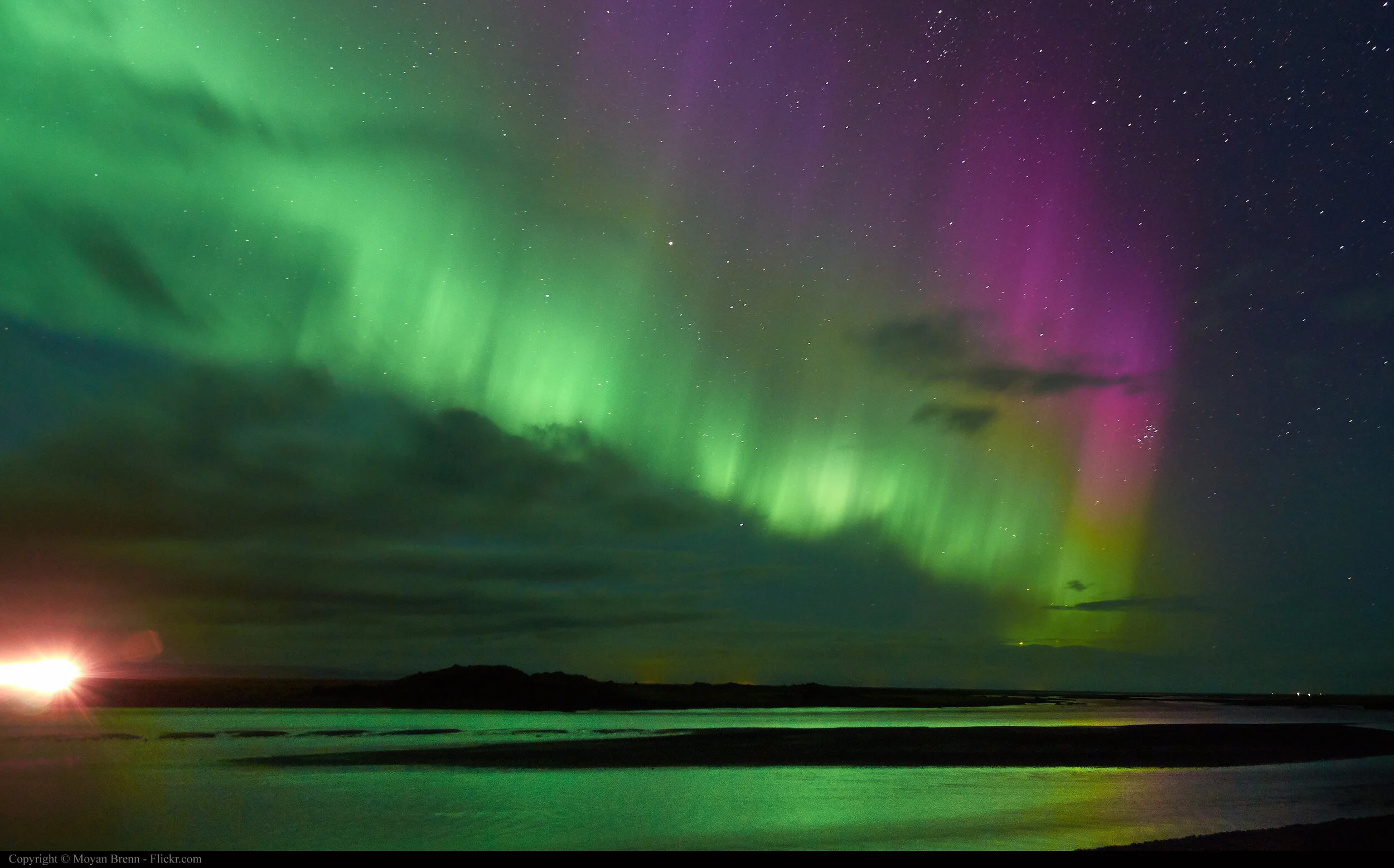
Check the copyright and permissions you need when using images, audio or video. (The northern lights pic used here is from wikimedia https://commons.wikimedia.org/wiki/File:Northern_lights_(9997815384).jpg)
And people shared resources which they are enjoying using.
Still curious
I'm still curious about how to solve some of the challenges of making online events have that same sense of occasion, of being different from one another. The screen people join through is a small part of their physical reality during the time they are with us. The room they are in is more significant. How can we help that to be beautiful too?
Making the Path by Walking
This post was first published in the June ‘20 edition of Making the Path by Walking newsletter. Scroll right down to subscribe.


